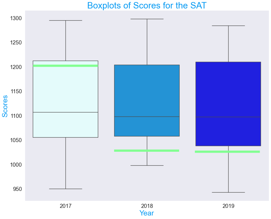
Distribution of SAT test scores throughout the years. Green line indicates where Colorado fell each year to highlight impact of scores when requiring the test.
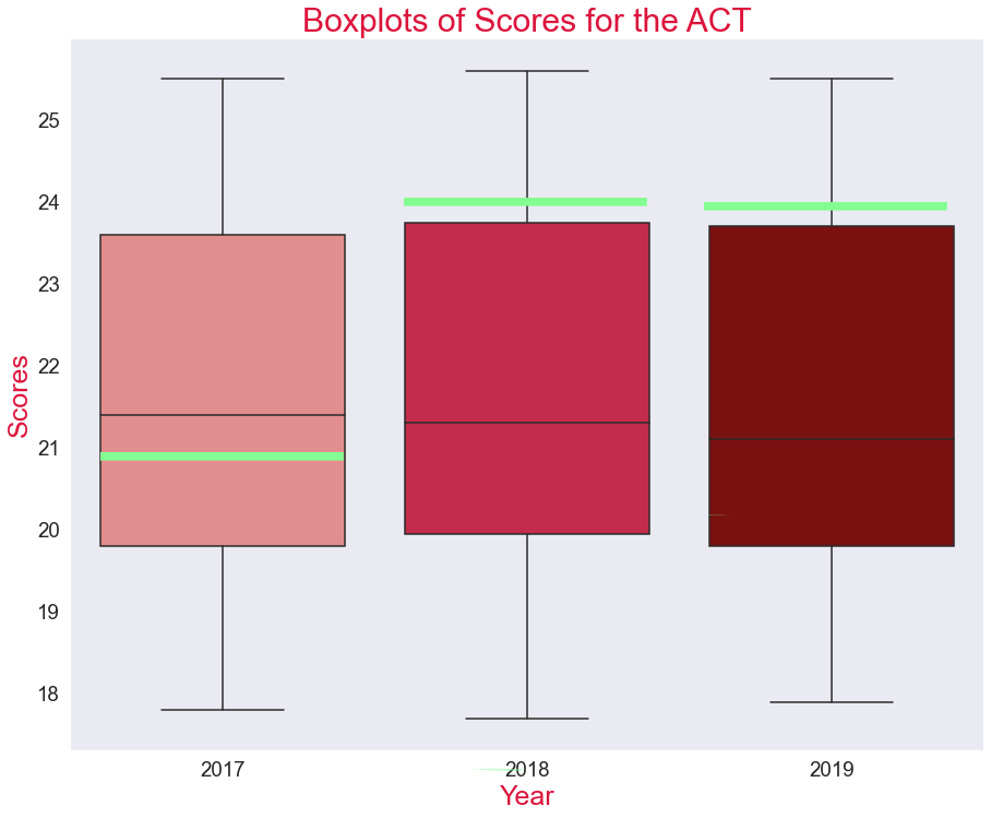
Distribution of ACT test scores throughout the years. Green line indicates where Colorado fell each year to highlight impact of scores when not requiring the test.
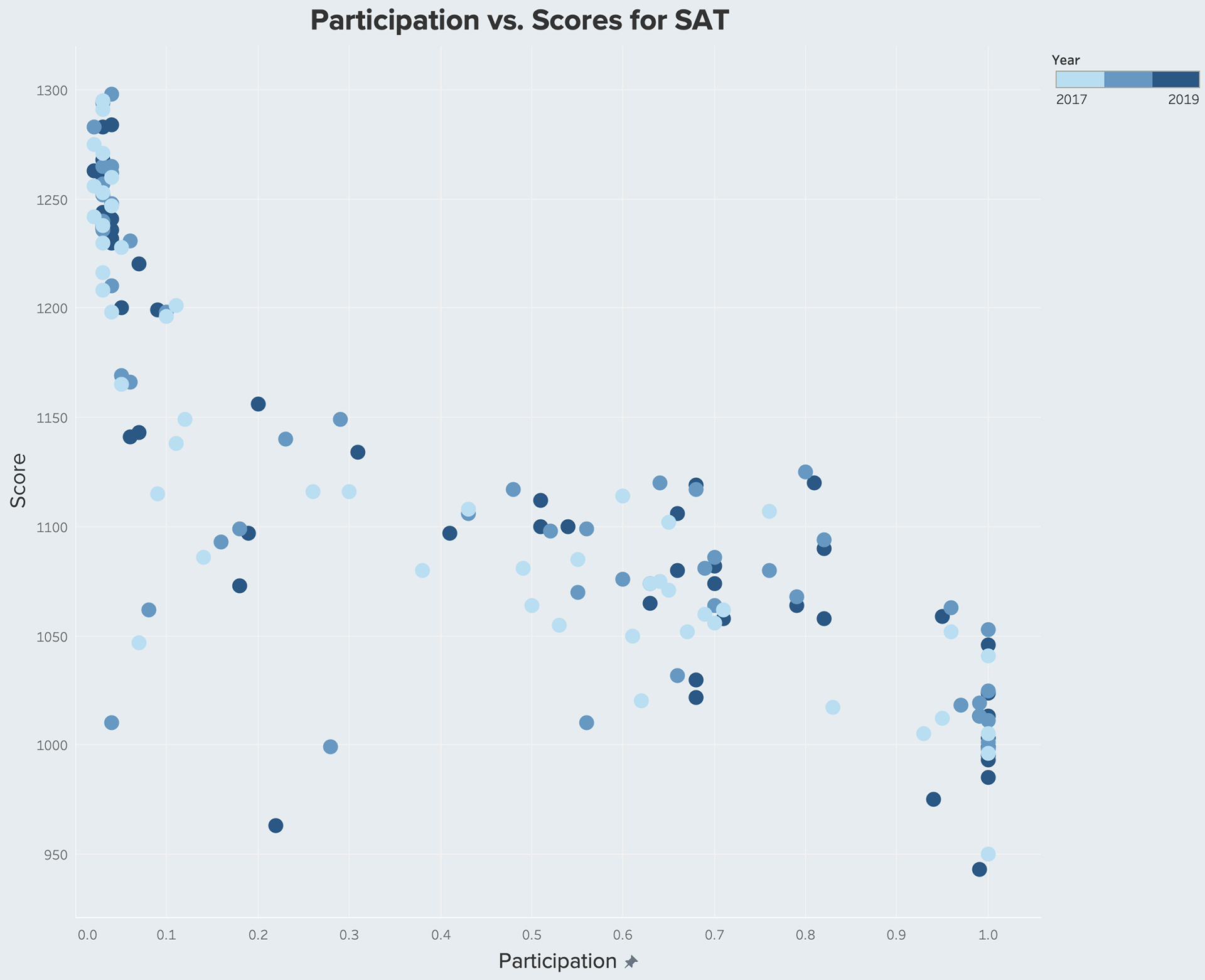
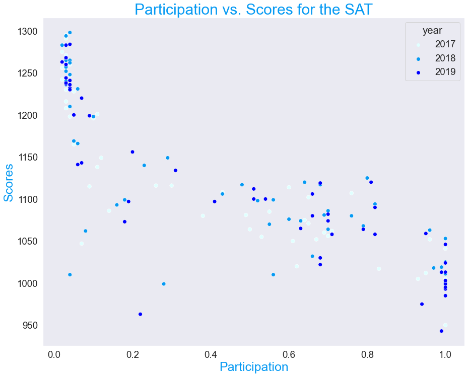
A scatterplot to demonstrate relationship between participation and scores: scores decrease as participation increases.
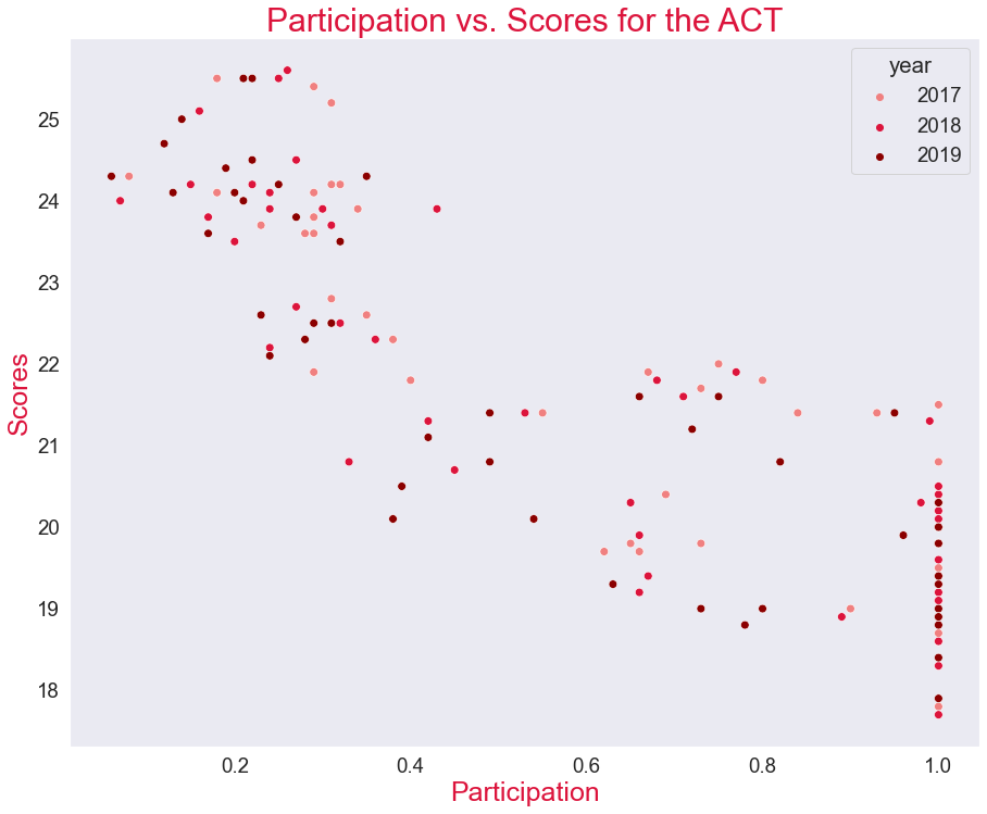
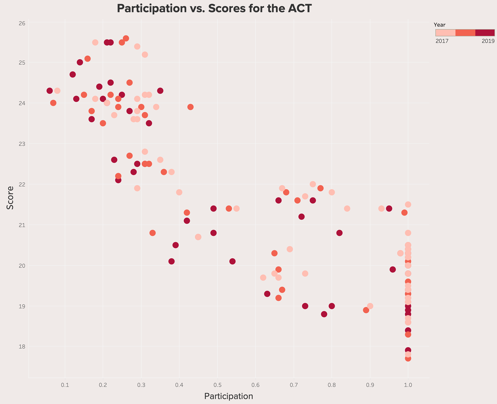
A scatterplot to demonstrate relationship between participation and scores: scores decrease as participation increases.
Results: Participation rates and scores are negatively correlated: as participation increases, scores increase.
See below for visualizations created with Tableau.
Same visual as above created with Tableau.