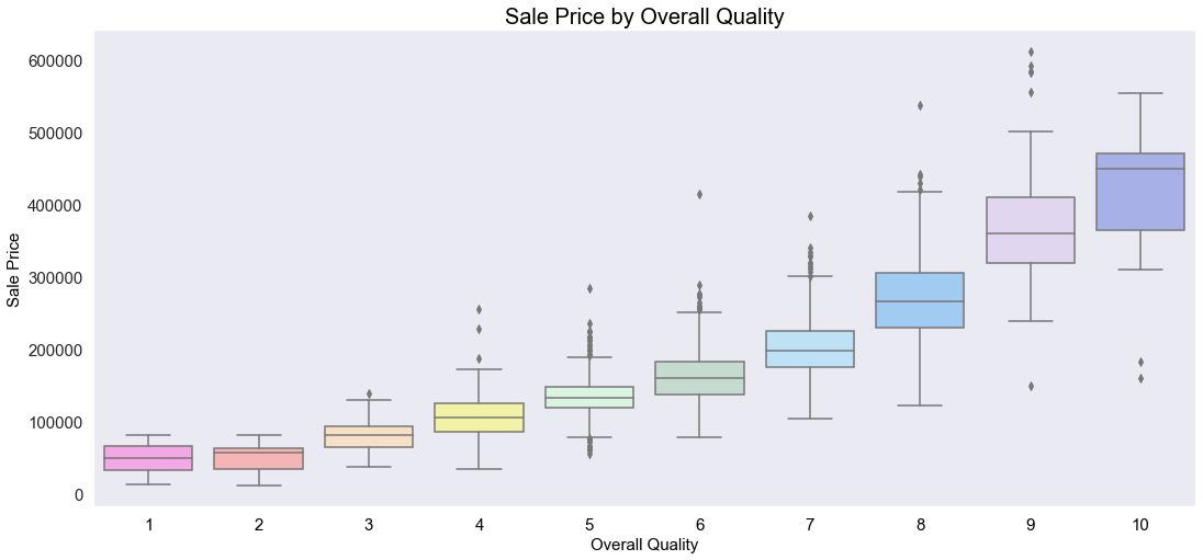
Boxplots that demonstrate the relationship between overall quality level and sale price: price increases as quality increases.
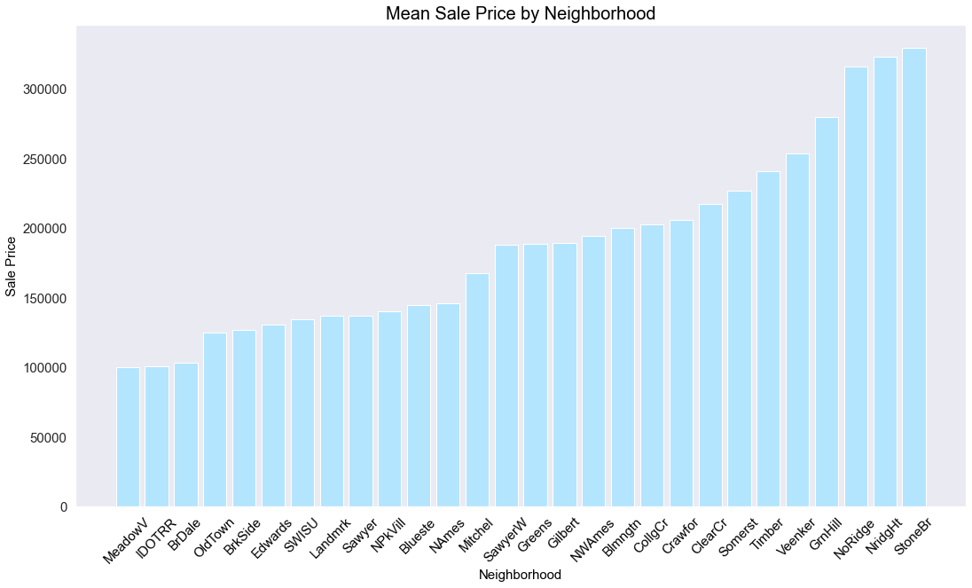
A bar chart that breaks down the average price of a house in each neighborhood.
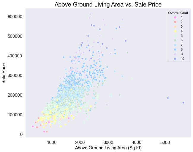
A scatter plot to demonstrate the relationship between above ground living area (square feet) , sale price, and overall quality: as above ground living area and quality increases, the sale price also increases.
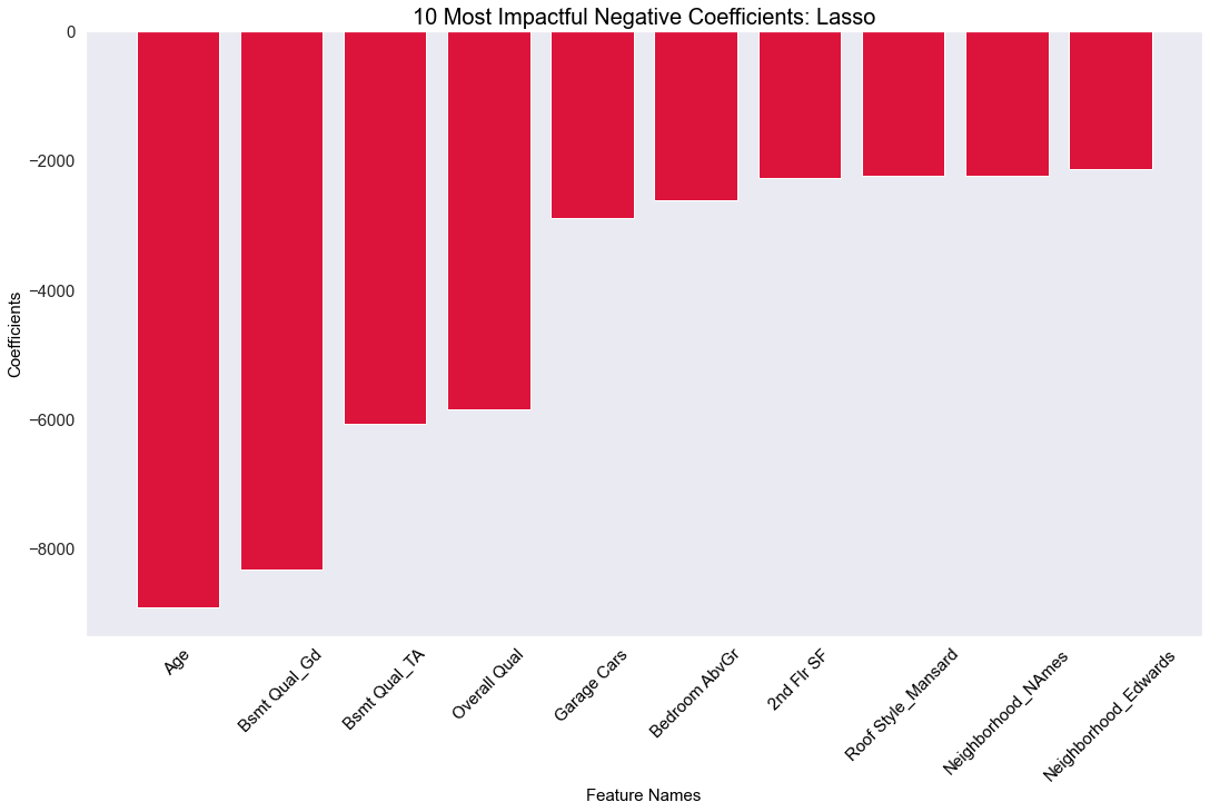
A bar chart to demonstrate which features negatively impact the price the most.
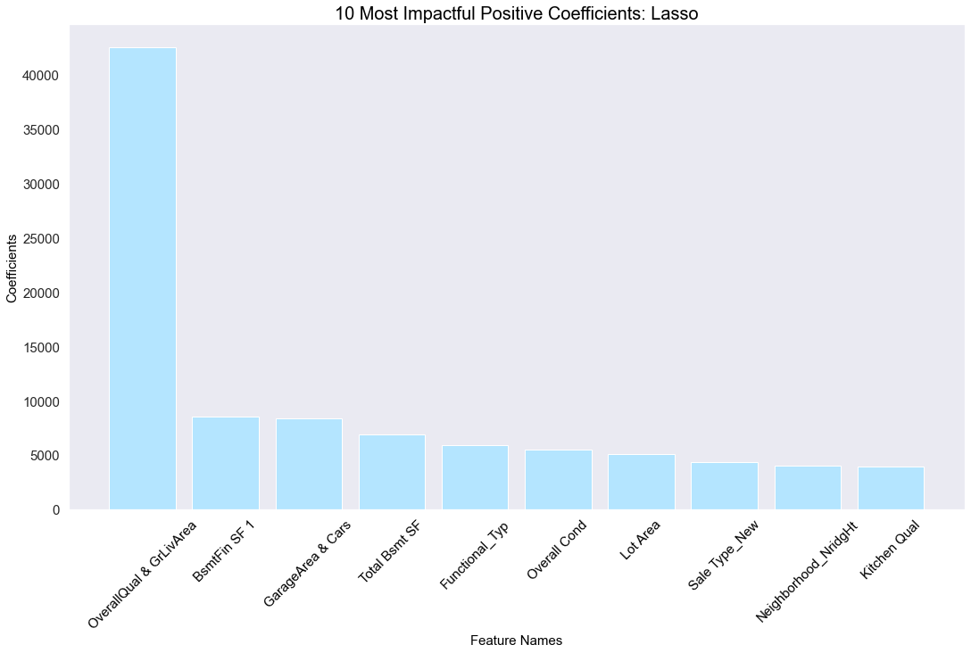
A bar chart to demonstrate which features positively impact the price the most.
Results: The lasso regression model was able to explain about 92% of the variance in the results. The overall quality score and ground living area square footage had the highest positive coefficients, suggesting that those factors positively impacted the price of a house of the most.